Graphic Design Illustration Storytelling Latin Art

Vené Logo

Vené Logo

VENÉ is a rebranding project for the Greater Philadelphia Hispanic Chamber of Commerce (GPHCC?) as a lockup identity

The Greater Philadelphia Hispanic Chamber of Commerce

The Greater Philadelphia Hispanic Chamber of Commerce is an organization dedicated to empowering Hispanic independent business owners through educational programs, seminars, pop-up events, and the like in an endeavor to benefit Hispanic businesses in the greater Philadelphia area.

That said, their name is a mouth-full.

In this project, I aim to rebrand the chamber through a lock-up approach to create a shorter, more memorable branding concept that can help to attract the businesses that they seek to empower.

Existing Branding

Overview

Established in 1990, the Greater Philadelphia Hispanic Chamber of Commerce (GPHCC) is a not-for-profit organization devoted to promoting the advancement and economic growth of Hispanic businesses and professionals in the greater Philadelphia region. We accomplish this through educational programs, a broad range of services, and special events. The GPHCC proactively serves a diverse membership—consisting of entrepreneurs, Latino businesses, Latino professionals, corporations, and government—with the overriding goal of helping these critical constituencies capitalize on the many opportunities their diversity, enhanced by our Latino multicultural mix, offers.

Mission

To develop, promote and advocate for Hispanic business in the Greater Philadelphia region while encouraging the advancement and economic growth of the Hispanic community.

Vision

To be recognized as the premier resources organization and voice servicing Hispanic businesses as well as the major force of positive change in the Latino business community

The Greater Philadelphia Hispanic Chamber of Commerce is currently represented with a circular logo of what seems to be a resounding sound wave accompanied by the name in partially tracked type then bolded larger pt. font size.

Cultural References

Initial Font Exploration

ELEVAR seeks to empower Hispanic businesses from various industries and therefore needs to appear professional with an air of simplicity. Running an independent business is hard enough without having to figure out obscure methods to improve your revenue.

Therefore, I determined a wordmark based on an existing elegant font with a bit of tweaking would better serve the varied market that Elevar seeks to empower.

The font I initially selected is Lato, an Open Source font designed by Adam Twardoch, Botio Nikoltchev, and Łukasz Dziedzic. Upon finding inspiration in the lighter 300 pt. weight, I then moved on to developing the wordmark through a lengthy series of explorations.

Elevar | ELEVAR

Elevar | ELEVAR

Elevar | ELEVAR

Elevar | ELEVAR

Elevar | ELEVAR

Wordmark Exploration

Below you can see the evolution of the wordmark through my many studies.

Sationary

Adopting the signature red of the chamber, I took the wordmark design approach I selected from my exploration and tested it in a series of scenarioes based on professional stationery.

The very first design I created, and most commonly used in an organization like this, was the letterhead. I decided to lean into the diagonal led by the red rectangles in the wordmark to include the lockup of the chamber’s full name to enact the lockup.

From there I moved on to the business card and envelope designs that challenged my initial approach to utilize the red rectangles to deepen the branding essence.

Application examples

In today’s world, you can save a bookmark to a website on your phone and make it appear like an application. I thought of some more younger business owners possibly utilizing this unique function and took the time to develop a monogram design that could also be leveraged for an app icon.

Should the chamber ever create an app, I imagine it would look like the photo where I staged the app live on an Apple iPhone.

Taking things a step further, I thought of the inclusion of the wordmark in an office setting. The chamber at the time of my design project maintained an office presence as a part of a greater facility that housed other organizations. If the chamber wants to stand out and be easily recognized among other brands, I imagine they might print out vinyl die-cutes of the wordmark and place them on windows throughout the office and on facility directory signage.

I manipulated the image and placed the wordmark on the glass with a gentle light reflection to emulate the effect of being in a well-lit room. Granted, they may not do something like this, but I did design the wordmark to stand out and it feels really nice on glass.
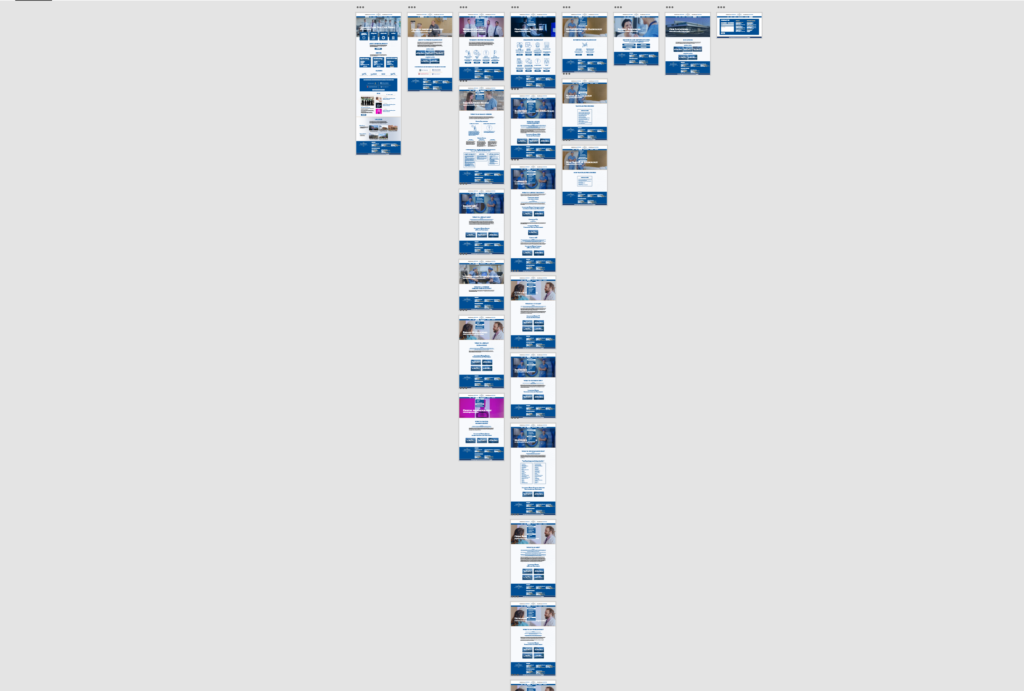
Website Design

The existing site for the chamber lacks organization, typographic hierarchy, and proper use of branding colors. In this initial above the fold website design, I imagine what the chamber might be more in line with communicating to their clients.

A clean, easy-to-navigate, and well-branded experience that provides an air of professionalism. Here I focused on a design that garners trust from small-business owners who may need help trusting the future of their business with the chamber.

Elevar Ad Spot

Considering Philly is a major city, getting the word out needs to go beyond printed material. Here I found stock video footage of Center City Philadelphia, and then created a little jingle, and developed a small ad spot for the organization.

Checkout the complete video with the jingle I created to go along with the motion graphic of the wordmark logo animation below.

ELEVAR Ad Spot

Categories ART

Escape

Escape

ESCAPE is a kinetic typography motion graphic that reenacts the escape scene from Themysicra in the Wonder Woman (2017) film directed by Patty Jenkins through kinetic typography

Believe In the Wonder

Wonder Woman has been an icon for women everywhere for over 80 years! She pioneered heroism, strength, courage, and truth in a world dominated by male superheroes since December 1941.

In Puerto Rico, La Mujer Maravilla was televised with Lynda Carter in the lead role and my mom was one of many who grew up watching her save the day with compassion and love. I took after my mom and fell in love with the character (she legit gave me the entire tv show collector’s edition DVD set for my 14th birthday) alongside Sailor Moon (she also had me watch the anime as a child) since lead female heroes were scarce during my childhood.

Given all of that history, of course, I wanted to help other people believe in the wonder through my art. It just wasn’t easy since I did not feel like I was good enough to draw or create anything based on her character. I was honestly in my head a bit too much.

Inspiration

When Patty Jenkins released her DC Live-Action film based on Wonder Woman, I was screaming. I mean I actually stood up in the theater and screamed “WONDER WOMAN!!!” during the big reveal scene at the crossing of No Man’s Land. When Steve Trevor explained that they could not save everyone, Diana simply replied, “No, but it’s what I’m going to do.” and I lost my marbles!

Anyways, don’t mind my fan-boy moment. Actually, this entire project is a fan-boy moment. However, instead of that landmark scene, I was more inspired by a subtle and emotional scene in the film when Diana escapes Themysicra with Steve Trevor in tow.

This scene is in my opinion one of the most important in regards to the development of Diana’s character as it correctly portrays one of Wonder Woman’s top qualities, her compassion and willingness to sacrifice. She fully knew that by leaving her home paradise island in order to save man’s world, she would let go of everything she ever knew and would never be allowed to return. This act is what separates Wonder Woman from her contemporaries, in that she did not choose to be a hero because of a tragedy she suffered, loss, or any other outside influence that could have driven her. She did it because it was the right thing to do. As she stated when her mother said that she may never return,

“Who will I be if I stay”.

Reference

I chose the exact scene when Diana escapes the island in the clip listed above. As for the color, there were a lot of blue-filtered scenes throughout the film, especially in the scene I chose. This gave me a good foundation for the color palette, along with the gold highlights from Wonder Woman’s iconic armor design.

The island background also provided a great soundscape to work off of as I utilized the sounds of the tide coming in to connect to the character’s departure to sea.

As for the font, Trajan was an appropriate choice designed in 1989 by Carol Twombly for Adobe and based on Roman square capitals. Given the more Greek influence of the mythology behind the heroine’s character origins, I wanted to touch on some of this without being too on the nose, hence the Roman font rather than a direct connection to Greece.

Process

I had to choose which moments to emphasize, like when Queen Hippolyta states, “They do not deserve you.” Given that the conversation was brief, I had to highlight the impact of what was said and how some of it would return at later parts of the film.

After a lot of back and fourth, I was happy with what phrases I chose and sketched out my ideas. I also included that water ripple effect I mentioned earlier at the very end. The effect was tempting to use more than once, but again this scene is subtle and elegant and the design should emulate that feeling while expanding on the weight of the conversation. This ideology informed my choice to use the water ripple effect at the end of the conversation upon Diana’s departure.

Develpoment

ESCAPE Kinetic Typography Video

Gendered Design Studies

Gendered Design

GENDERED DESIGN is an investigation into he gendered approaches to design in common scenarios that we take for granted in our day to day lives.

Should the identity of one’s gender be limited to visual appearances?

When we go out in public, odds are we are presented with the shared bathroom dilemma. Men can only go in one room, and women in another. The doors present an observation only representative of the socially accepted interpretation of gender by way of a human figure that seems to wear a dress and another that wears nothing, though pants are implied. But, in this day and age when Prince, Harry Styles, and Jaden Smith (male-identifying individuals) wear dresses and skirts, this approach to iconographic design is inaccurate. People are not, and never have been limited to the clothing that they wear, and this seemingly age-old design (not really because it was designed in 1974 by design firm Cook and Shanosky Associates) presents a limited view that we all take for granted.

Sketching For Inspiration

When designing for someting more enduring, and somewhat abstract, its always good to sketch out your ideas. Actually, you should sketch out all of your ideas all of the time.

Here are examples of my sketching process for the development of my new bathroom icons meant to focus on feeling and self-evident identity without limitation to one’s visual appearance. 

Medium

Upon selecting two sets of three potential identifiers, I scanned and transferred my hand sketches to digital and through the Adobe Photoshop threshold tool, I adapted them into digital .png files. Afterward, I reworked these sketches into more fluid and clean vector graphics using Adobe Illustrator and my best friend, the pen tool.

Example one

Yes, I really enjoy Tetris, and the shapes of figures used in the game are simple but elegant approaches to identity. Here I wanted to provoke viewers to find visual cues in how the shapes are designed and how they relate to the acts that people may or may not take to relieve themselves.

As a man, standing is a common position for urination. However, women must sit, and those with children are attached to them and will inevitably take them inside the bathroom with them for safety concerns. Men may generally select the first door since it seem to be a standing figure. Women may select the final door as it is a cube, and could be associated with a seat or someone sitting. And those with children may choose the middle door, since it looks like a taller and smaller figure (parent and child) are together in this figure.

Example Two

The second set of icons presents a less direct and more abstract approach to the idea of gender.

I thought of the curvy lines in the first icon as representative of the softer exterior generally associated with female forms. Not all women are curvy, some are more tall and slender, hence the strokes that fly out of the shape. The dot in the upper “P” shape represents the act of pregnancy and how a woman carries and gives birth to a child.

The middle icon is a geometric, and more solid aura of gender. Generally, male forms fit this aesthetic, but the circle and curvy stroke in the middle of the icon represent those men who do not identify as sharp, edgy, and structured, but as more fluid and open in their identity.

The most intricate icon is a deep dive into our emotions. Everyone has relationships where they have dominant and submissive roles that switch from time to time at least once in their lifetime. This approach represents the myriad of emotions one feels upon enacting, and experiencing these roles in their social experiences. So, it is totally open for interpretation.

While fun, these approaches still in some way feel somewhat gendered to me by leaning slightly into visual aspects of one’s body. However, the beauty of it lies in that anyone can associate with these figures either emotionally or metaphysically by how they present themselves in their own minds and presented their appearance to others.

Design Appreciation

Puerto Rico Matters

Puerto Rico Matters

PUERTO RICO MATTERS is a motion graphic clip highlighting the lack of support from the U.S. in the aftermath of hurricane Maria.

Design that Matters

Designers are storytellers like journalists and can create work that sparks hope and change in the world. I hope in my career I will have a chance to design for causes that I am passionate about like the Hurricane Maria relief effort for Puerto Rico.

I am Puerto Rican, and Dominican, and have a heritage that also traces back to what is today considered Israel. I was primarily raised by my single mother of Puerto Rican descent and therefore cherish my culture. Since Hurricane Maria left my home away from home in ruin I wanted to support the island in some way through my skillset.

My University would not allow me to take time off to go to the island to volunteer, or else it would have cost me that semester. I was the only Puerto Rican, and Latin student in my classes, so no one understood how it felt or why I personally felt obligated to help. So I used a project as an opportunity to vent, which inevitably led to the creation of my online business and store Vené.

Doctors Who Create Website

Doctors Who Create Website

DOCTORS WHO CREATE WEBSITE is a large design project to replace the existing DWC site for their 1000+ creative doctor users

Who knew Doctors could be so cool

After 96 Years of Firehouse Service, then a stint where it was converted into apartments, the antiquated building was then abandoned until it was restored into the Camden Fireworks Art Gallery where I happened to have my very first studio working space.

Camden Fireworks is a dedicated space for artists to both practice, and display their works for viewing and purchase. Here you can find monthly engagements open to the public like free painting classes for children, poetry nights, and live gallery shows to name a few.

Typography Study Foundation

In this project, I focused on maintaining the core elements of the gallery’s original branding. My goal was to emphasize these elements by replacing the custom font in the logo with an existing one followed by branding assets that incorporate the new font while furthering the branding experience.

I first practiced with other existing brands where the font carried all of the weight of their branding experience. Through experimenting with fashion house Balmain, I discovered the integrity of their existing font selection and the taste it implies as it associates with their clothing.

Existing Website Presence

The existing website is difficult to navigate, the colors vibrate at times, and the copy gets lost for lack of contrast and legibility. 

Website Design

Overview

Established in 1990, the Greater Philadelphia Hispanic Chamber of Commerce (GPHCC) is a not-for-profit organization devoted to promoting the advancement and economic growth of Hispanic businesses and professionals in the greater Philadelphia region. We accomplish this through educational programs, a broad range of services, and special events. The GPHCC proactively serves a diverse membership—consisting of entrepreneurs, Latino businesses, Latino professionals, corporations, and government—with the overriding goal of helping these critical constituencies capitalize on the many opportunities their diversity, enhanced by our Latino multicultural mix, offers.

Mission

To develop, promote and advocate for Hispanic business in the Greater Philadelphia region while encouraging the advancement and economic growth of the Hispanic community.

Vision

To be recognized as the premier resources organization and voice servicing Hispanic businesses as well as the major force of positive change in the Latino business community

Brochure

The brochure presented an opportunity to play, experiment, and be a little extra. In this design, I represented the beautiful exposed brick from within the gallery as an accent design adorning the background while also leading the eye. I admit it can use some fine-tuning, but overall this was a fun asset to develop.

error: Content is protected !!