Graphic Design Illustration Storytelling Latin Art

Doctors Who Create Website

Doctors Who Create Website

DOCTORS WHO CREATE WEBSITE is a large design project to replace the existing DWC site for their 1000+ creative doctor users

Who knew Doctors could be so cool

After 96 Years of Firehouse Service, then a stint where it was converted into apartments, the antiquated building was then abandoned until it was restored into the Camden Fireworks Art Gallery where I happened to have my very first studio working space.

Camden Fireworks is a dedicated space for artists to both practice, and display their works for viewing and purchase. Here you can find monthly engagements open to the public like free painting classes for children, poetry nights, and live gallery shows to name a few.

Typography Study Foundation

In this project, I focused on maintaining the core elements of the gallery’s original branding. My goal was to emphasize these elements by replacing the custom font in the logo with an existing one followed by branding assets that incorporate the new font while furthering the branding experience.

I first practiced with other existing brands where the font carried all of the weight of their branding experience. Through experimenting with fashion house Balmain, I discovered the integrity of their existing font selection and the taste it implies as it associates with their clothing.

Existing Website Presence

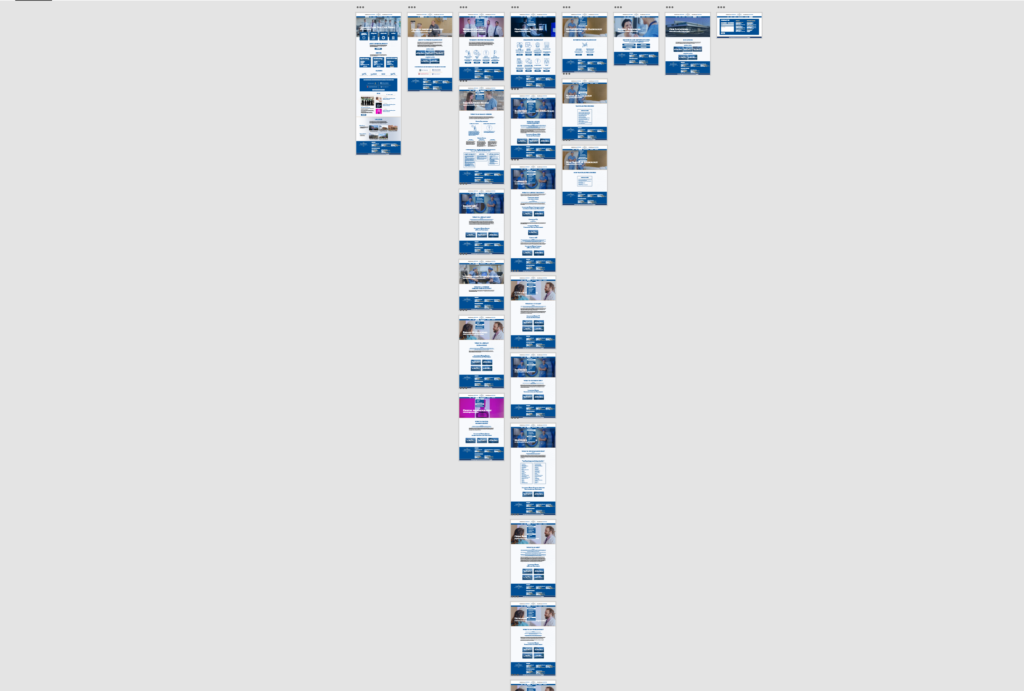
The existing website is difficult to navigate, the colors vibrate at times, and the copy gets lost for lack of contrast and legibility. 

Website Design

Overview

Established in 1990, the Greater Philadelphia Hispanic Chamber of Commerce (GPHCC) is a not-for-profit organization devoted to promoting the advancement and economic growth of Hispanic businesses and professionals in the greater Philadelphia region. We accomplish this through educational programs, a broad range of services, and special events. The GPHCC proactively serves a diverse membership—consisting of entrepreneurs, Latino businesses, Latino professionals, corporations, and government—with the overriding goal of helping these critical constituencies capitalize on the many opportunities their diversity, enhanced by our Latino multicultural mix, offers.

Mission

To develop, promote and advocate for Hispanic business in the Greater Philadelphia region while encouraging the advancement and economic growth of the Hispanic community.

Vision

To be recognized as the premier resources organization and voice servicing Hispanic businesses as well as the major force of positive change in the Latino business community

Brochure

The brochure presented an opportunity to play, experiment, and be a little extra. In this design, I represented the beautiful exposed brick from within the gallery as an accent design adorning the background while also leading the eye. I admit it can use some fine-tuning, but overall this was a fun asset to develop.

Lourdes Radiology

Lourdes Radiology

LOURDES RADIOLOGY is a website on Park Bom (BOM) celebrating her debut song Spring.

2NE1 and the Legacy of Female-led Groups in the music industry

Music has been an important part of my life since my childhood, and girl groups hold a very special place in my heart for their songs about love, independence, and belief in oneself. One such group from the K-Pop scene of South Korea epitomized these themes, paving the way for all-girl groups that would come after.

The prolific 2NE1 is comprised of Park Bom, Sandara Park, Minzy, and the self-proclaimed “baddest female” CL leading the group. It was this girl group’s 2009 debut that introduced the United States and many other countries to K-Pop music. However, they have since disbanded, and have forged their own solo careers that continue to inspire fans like myself today.

The long-awaited return of their former lead vocalist, Park Bom was especially exciting! This was her solo debut and first appearance in the public eye since the 2016 disbandment of the group. In celebration of her return, I set out to design a few pieces inspired by the music video of her debut song Spring.

Inspiration

In my earlier years as a traditional artist, I feared using color in any of my work. With sketchbooks full of charcoal, graphite, and ink drawings, the use of color simply did not fit in. I did not understand it. Everytime I used it in a piece I permanently messed it up. And I just…no

When I finally discovered vector art at fourteen in my graphic design vocation class, color suddenly became a possibility. Through trial and error I found myself moving in the opposite direction of my style as a traditional artist from highly detailed black white, and grey drawings, to restricted two or four bold color illustrations that popped off the screen. I doubted myself often, and spent countless hours reworking edges, and curves trying to emulate fluid movements even at points of juncture at edges. It was not until I came across the work of Malika Favre that I began to trust my instincts.

Favre exhibits effortless splashes of color in provocative and at times subtle vector illustrations in magazines, promotional packaging, and motion graphics. The French artist inspires me to trust my process, and allow myself to have fun along the way.

Malika Favre

Reference

This gif shows the moment from the music video that I found most inspiring, and would eventually reference. The crimson jacket and lips, strands of hair frayed aside from the well styled body, and her eyes looking above and then outward together  indicate a struggle. The white oval zipper tag represents the purity of familial bonds, whilst the red all around it represents the all consuming hate that surrounded them.

Process

Working from reference provides a strong platform to build upon. Although, I believe as a designer we sometimes need to strip away the safety of a balanced experience in order to provoke the truest emotions and convey purer messages.

In my process I embark on a journey of discovering what the piece wants to become, and how I want to communicate that identity with the tools afforded to me. In the process of creating DARA, I sketched around the form of the model and captured an exact likeness. Then I worked to pull away elements that hindered the experience, while elevating some that would aid in provoking the desired emotions.

Below you will see the development period, and follow visually with me as I made decisions to remove and alter the piece.

Develpoment

Process

Working from reference provides a strong platform to build upon. Although, I believe as a designer we sometimes need to strip away the safety of a balanced experience in order to provoke the truest emotions and convey purer messages.

In my process I embark on a journey of discovering what the piece wants to become, and how I want to communicate that identity with the tools afforded to me. In the process of creating DARA, I sketched around the form of the model and captured an exact likeness. Then I worked to pull away elements that hindered the experience, while elevating some that would aid in provoking the desired emotions.

Below you will see the development period, and follow visually with me as I made decisions to remove and alter the piece.

Desing Appreciation

Doctors Who Create Merch

Doctors Who Create

DOCTORS WHO CREATE is a rebranding, merchandise design, and website design project for an organization that unites and celebrate doctors who are also creatives and artists.

The Coolest Doctors Create

Working with these doctors was a wonderfully enlightening and heart-warming experience for me. I enjoyed learning about the passion behind this organization and the people who are trying to find creative ways to change common approaches to patient care.

Through directly communicating with the clients, I was able to develop a website and merchandise that in their words, “Amazed us!”

Existing Branding

Overview

The organization has worked on a limited budget, and therefore could not afford to hire professional design services. Everything they had produced was entirely done by in-house creatives that were a part of their organization. From the mugs to their cards, and even their logo and website, all were created by their own artists.

Mission

The doctors needed a more professional branding experience, and though I worked in a group to develop their new logo design, I was entirely responsible for the design of their merchandise, and website.

Vision

The doctors are not limited to the visual arts, they also participate in the performing arts. Some play instruments, others are ballerinas, gymnasts, and poets. With a varied collection of creatives in their organization, we needed to develop an identity that respected all forms of creativity along with strong merchandise that was functional and could be used for more than just brand recognition.

Font Exploration

Merchandise

After redesigning the brand logo, and associating a font with their angel, I took over and created pieces approved by the clients that could be useful beyond brand recognition. The Doctors Who Create have an annual festival-like event that brings together the creatives to present their talents, and their ideas of how they might include them in their approaches to patient care. At this event, the organization hands out merchandise to attendees, and I was challenged with the selection and design of functional items.

I chose a notepad, grocery tote, and mug.

error: Content is protected !!