

Hunts Study
Upon researching the Hunts website, there is a heavy emphasis on their method of peeling tomatoes via steam power rather than through the use of chemicals.
Given their stance to provide a more natural selection of tomatoe based products, I chose to focus on that simple truth. “Always natural. Never modified.” I then selected a photo of tomatoes via unsplash, grabbed their logo .png and created the simple but effective advertisement to the right.
Swiffer Study
Swiffer was a bit more of a fun project since I have not had many opportunities to work with a heavy green palette or animals. In this project, I chose to target troubled pet parents like my friends, and their feline companions. I made a play on the tendency for cats to bring chaos wherever they go, so it informed my approach within the copy.
I got a hold of this near-perfect image for my advertisement on Unsplash, and put this design together.
Bee’s Wrap Experiential Advertisement
Purell Ad Campaign
Purell became an absolute necessity in 2020 and people have come to associate it with a sense of security and safety. However, people (especially me) are tired of the fearful approach that companies have taken to marketing in this pandemic era.
People here in the states did not realize we as Puerto Ricans, like them, were in fact United States citizens. This massive ignorance was further empowered by the many tweets and discussions by Donald Trump, who disrespectfully stated
“Puerto Rico is one of the most corrupt places on earth.”
I was distraught as a Puerto Rican. I was infuriated as a Latino. I was driven as a graphic designer. This harrowing series of events led to my creation of Vené, an online store dedicated to the representation and education of Latin culture, beginning with Puerto Rican culture.
The Coolest Doctors Create
Working with these doctors was a wonderfully enlightening and heart-warming experience for me. I enjoyed learning about the passion behind this organization and the people who are trying to find creative ways to change common approaches to patient care.
Through directly communicating with the clients, I was able to develop a website and merchandise that in their words, “Amazed us!”
Existing Branding
The organization has worked on a limited budget, and therefore could not afford to hire professional design services. Everything they had produced was entirely done by in-house creatives that were a part of their organization. From the mugs to their cards, and even their logo and website, all were created by their own artists.
The doctors needed a more professional branding experience, and though I worked in a group to develop their new logo design, I was entirely responsible for the design of their merchandise, and website.
The doctors are not limited to the visual arts, they also participate in the performing arts. Some play instruments, others are ballerinas, gymnasts, and poets. With a varied collection of creatives in their organization, we needed to develop an identity that respected all forms of creativity along with strong merchandise that was functional and could be used for more than just brand recognition.
Font Exploration
Merchandise
After redesigning the brand logo, and associating a font with their angel, I took over and created pieces approved by the clients that could be useful beyond brand recognition. The Doctors Who Create have an annual festival-like event that brings together the creatives to present their talents, and their ideas of how they might include them in their approaches to patient care. At this event, the organization hands out merchandise to attendees, and I was challenged with the selection and design of functional items.
I chose a notepad, grocery tote, and mug.
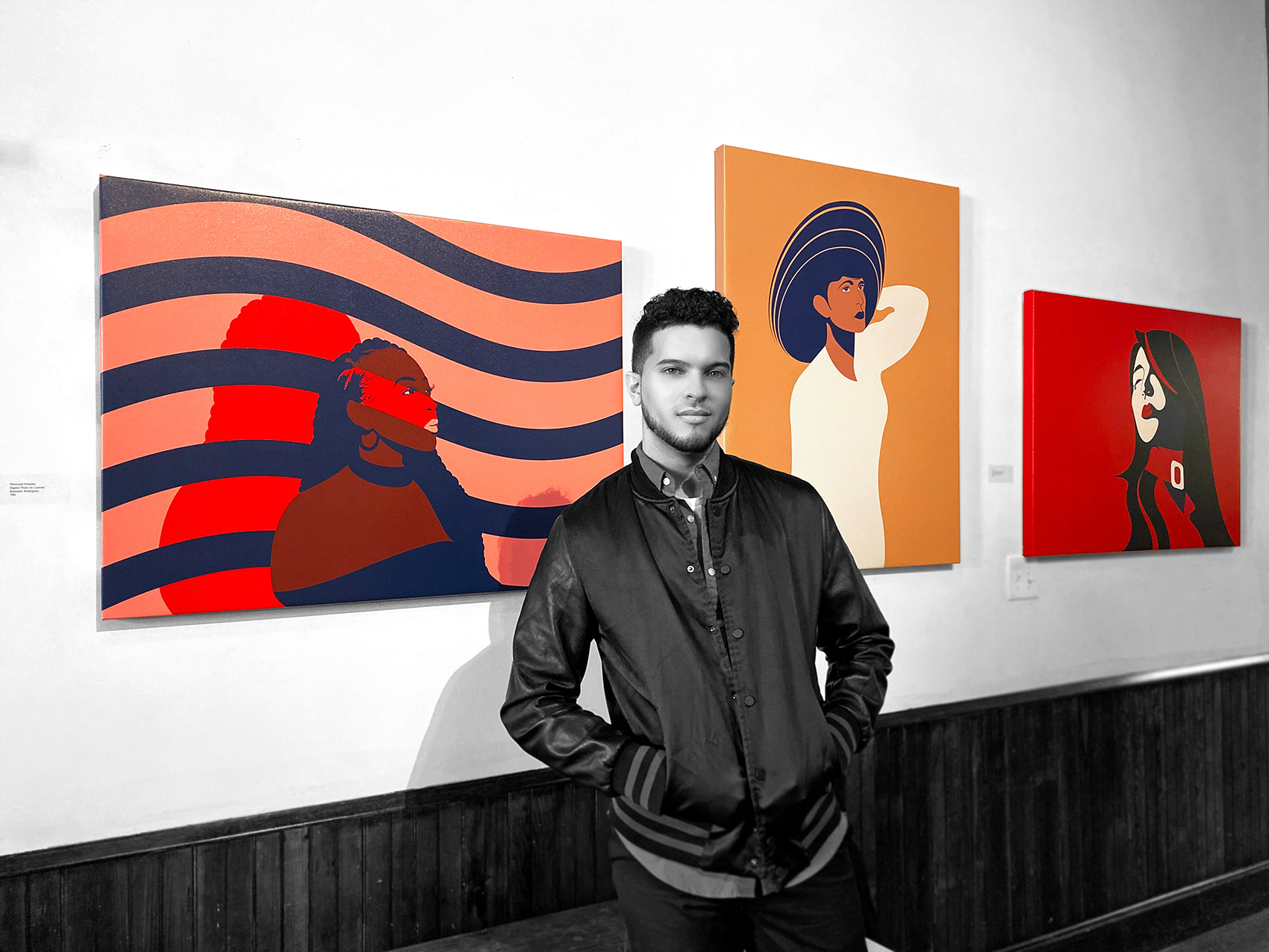

Back in 2018, through a connection with my friend and mentor Marcy Morris, I discovered Camden Fireworks. Fireworks is an art gallery on South Broadway carved out of an old firehouse. The building was repurposed into an apartment and then to provide studio spaces for artists, while hosting exhibitions for both Camden City and visiting artists alike.
It was here that I became acquainted with Cassie, the poet who ran the space and welcomed me into my very first studio. It was also here, that I shared my very first exhibition with my fellow artists from the studio spaces upstairs in November 2019.

El Isla del Encanto
Music has been an important part of my life since my childhood, and girl groups hold a very special place in my heart for their songs about love, independence, and belief in oneself. One such group from the K-Pop scene of South Korea epitomized these themes, paving the way for all-girl groups that would come after.
References
Puerto Rico is known as a tropical paradise, and in this design, I leaned into that initial belief held by most tourists and the U.S. at large. Taking careful consideration, I spent the summer of 2019 designing this piece as my very first hard enamel pin in a series of pins that I devised to be launched as the first products of my independent business, Vené.
The elements of the pin design are as follows:
Sketches
Initial Font Exploration
Established in 1990, the Greater Philadelphia Hispanic Chamber of Commerce (GPHCC) is a not-for-profit organization devoted to promoting the advancement and economic growth of Hispanic businesses and professionals in the greater Philadelphia region. We accomplish this through educational programs, and a broad range of services and special events. The GPHCC proactively serves a diverse membership—consisting of entrepreneurs, Latino businesses, Latino professionals, corporations and government—with the overriding goal of helping these critical constituencies capitalize on the many opportunities their diversity, enhanced by our Latino multicultural mix, offers.
Philadelphia Hispanic Chamber of Commerce
Philadelphia Hispanic Chamber of Commerce
Philadelphia Hispanic Chamber of Commerce
Philadelphia Hispanic Chamber of Commerce
Philadelphia Hispanic Chamber of Commerce
Logo Exploration
Sationary
Working from reference provides a strong platform to build upon. Although, I believe as a designer we sometimes need to strip away the safety of a balanced experience in order to provoke the truest emotions and convey purer messages.
In my process I embark on a journey of discovering what the piece wants to become, and how I want to communicate that identity with the tools afforded to me. In the process of creating DARA, I sketched around the form of the model and captured an exact likeness. Then I worked to pull away elements that hindered the experience, while elevating some that would aid in provoking the desired emotions.
Below you will see the development period, and follow visually with me as I made decisions to remove and alter the piece.
Application examples
A massive storm, with a death toll higher than that of Katrina, hit Puerto Rico in September 2018. This force of nature was hurricane Maria, and it killed over 3,000 United States citizens. However, rather than headlines describing us as a people in need, I only saw phrases like “foreigners”, “immigrants”, and “freeloaders” to name a few.
People here in the states did not realize we as Puerto Ricans, like them, were in fact United States citizens. This massive ignorance was further empowered by the many tweets and discussions by Donald Trump, who disrespectfully stated
“Puerto Rico is one of the most corrupt places on earth.”
I was distraught as a Puerto Rican. I was infuriated as a Latino. I was driven as a graphic designer. This harrowing series of events led to my creation of Vené, an online store dedicated to the representation and education of Latin culture, beginning with Puerto Rican culture.
Website Design
Established in 1990, the Greater Philadelphia Hispanic Chamber of Commerce (GPHCC) is a not-for-profit organization devoted to promoting the advancement and economic growth of Hispanic businesses and professionals in the greater Philadelphia region. We accomplish this through educational programs, a broad range of services, and special events. The GPHCC proactively serves a diverse membership—consisting of entrepreneurs, Latino businesses, Latino professionals, corporations, and government—with the overriding goal of helping these critical constituencies capitalize on the many opportunities their diversity, enhanced by our Latino multicultural mix, offers.
To develop, promote and advocate for Hispanic business in the Greater Philadelphia region while encouraging the advancement and economic growth of the Hispanic community.
To be recognized as the premier resources organization and voice servicing Hispanic businesses as well as the major force of positive change in the Latino business community
Elevar Ad Spot
Music has been an important part of my life since my childhood, and girl groups hold a very special place in my heart for their songs about love, independence, and belief in oneself. One such group from the K-Pop scene of South Korea epitomized these themes, paving the way for all-girl groups that would come after.
Iterations
DARA is a vector illustration based on Sandara Park, known to all her fans as Dara, who made a surprising return herself in Park Bom’s music video for Spring. At the time of the song’s debut, Dara had not released any music of any kind since the group’s disbandment. That was three years of nothing but modeling and acting appearances on her part, so when she appeared here it meant a lot to the fans.
Clothed in a burning crimson suit jacket, Dara had a forlorn look-conveying all of the pain that fans worldwide struggled with. It was a slow-burning experience to watch Park Bom be the target of ridicule as she was apprehended back in 2015 for unknowingly transporting medication for her ADHD from Korean news outlets and fans alike, accusing her of smuggling her ADHD medication into the country.

2NE1 and the Legacy of Female-led Groups in the music industry
Music has been an important part of my life since my childhood, and girl groups hold a very special place in my heart for their songs about love, independence, and belief in oneself. One such group from the K-Pop scene of South Korea epitomized these themes, paving the way for all-girl groups that would come after.
The prolific 2NE1 is comprised of Park Bom, Sandara Park, Minzy, and the self-proclaimed “baddest female” CL leading the group. It was this girl group’s 2009 debut that introduced the United States and many other countries to K-Pop music. However, they have since disbanded, and have forged their own solo careers that continue to inspire fans like myself today.
The long-awaited return of their former lead vocalist, Park Bom was especially exciting! This was her solo debut and first appearance in the public eye since the 2016 disbandment of the group. In celebration of her return, I set out to design a few pieces inspired by the music video of her debut song Spring.
Inspiration
In my earlier years as a traditional artist, I feared using color in any of my work. With sketchbooks full of charcoal, graphite, and ink drawings, the use of color simply did not fit in. I did not understand it. Everytime I used it in a piece I permanently messed it up. And I just…no
When I finally discovered vector art at fourteen in my graphic design vocation class, color suddenly became a possibility. Through trial and error I found myself moving in the opposite direction of my style as a traditional artist from highly detailed black white, and grey drawings, to restricted two or four bold color illustrations that popped off the screen. I doubted myself often, and spent countless hours reworking edges, and curves trying to emulate fluid movements even at points of juncture at edges. It was not until I came across the work of Malika Favre that I began to trust my instincts.
Favre exhibits effortless splashes of color in provocative and at times subtle vector illustrations in magazines, promotional packaging, and motion graphics. The French artist inspires me to trust my process, and allow myself to have fun along the way.
Malika Favre
Medium
DARA is a vector illustration based on Sandara Park, known to all her fans as Dara, who made a surprising return herself in Park Bom’s music video for Spring. At the time of the song’s debut, Dara had not released any music of any kind since the group’s disbandment. That was three years of nothing but modeling and acting appearances on her part, so her unexpected appearance meant a lot to us fans.
Clothed in a burning crimson suit jacket, Dara had a forlorn look-conveying all of the pain that fans worldwide struggled with. It was a slow-burning experience to watch Park Bom be the target of ridicule and disgust, as she was apprehended back in 2015 for transporting medication for her ADHD. She was legally prescribed in the U.S., but the medication was actually illegal in Korea since most mental disorders are not recognized by their medical community. Korean fans and news outlets alike accused the singer of smuggling drugs, as if they were hard-core narcotics and it almost ruined her career.
In this vector illustration, the smooth curves I achieved with the pen tool in Adobe Illustrator were essential to capturing the emotions that I imagine Dara may have felt. I have been in situations in my life where I had to allow loved ones to suffer for a variation of reasons. Sometimes they do not want your help, other times you are bound by rules set by others and even the law.
The artistic choices I made were efforts to simplify the experience. The curated strokes and shapes ensured the rendering only highlighted that which I deemed relevant toward guiding viewers. It is an emotional experience tinged with frustration refined by silence.
How does it feel to watch a person that you care deeply for struggle and suffer the emotional onslaught of berating voices that you were powerless to silence? Have you ever wanted to help someone, but could only stand and watch?
That is what this piece feels like,
Reference
This gif shows the moment from the music video that I found most inspiring, and would eventually reference. The crimson jacket and lips, strands of hair frayed aside from the well styled body, and her eyes looking above and then outward together indicate a struggle. The white oval zipper tag represents the purity of familial bonds, whilst the red all around it represents the all consuming hate that surrounded them.
Process
Working from reference provides a strong platform to build upon. Although, I believe as a designer we sometimes need to strip away the safety of a balanced experience in order to provoke the truest emotions and convey purer messages.
In my process I embark on a journey of discovering what the piece wants to become, and how I want to communicate that identity with the tools afforded to me. In the process of creating DARA, I sketched around the form of the model and captured an exact likeness. Then I worked to pull away elements that hindered the experience, while elevating some that would aid in provoking the desired emotions.
Below you will see the development period, and follow visually with me as I made decisions to remove and alter the piece.
Develpoment
Desing Appreciation

Getting the Modern Woman Ready
I was raised by a single mother of four and surrounded by sisters, and grandmothers my entire life. Mornings always began with makeup, hair, and coffee, sometimes all at the same time. But I wondered why they had to go through so much effort, to feel ready for the day.
Some of them performed these tasks because they enjoy them and apply them as a form of self-care. Others felt they had to or they would be treated differently-looked down upon because they did not align with the employee attire guidelines. Such was required of them, but not so much of their male peers.
In this vector illustration, I explore the concept of a woman getting ready. What is required, what outfit to wear, and how can she empower herself without feeling like she is bound to the physical expectations of her male contemporaries.
Reference
For this illustrations, I wanted to go against the common tropes associated with beauty standards represented in films, shows, video games, comics, etc. The female characters are almost always voluptuous, scantily dressed, with heavy contouring makeup, or unrealistic body shapes like tiny waists, and overaccentuated breasts.
Therefore, I chose a model that I could represent without the need to indicate her sexualized features like breasts and butt. The struggle was trying to indicate feminity without portraying the features that men have led me to believe.
Photo by Romane Van Troost via Unsplash
Design Process
Desing Appreciation

Art saves lives, but to an even greater degree; it enriches them. In May 2018, I was invited by my wonderful friend Marcy Morris, and these super cool kids to show them some basic practices of poster making and color theory.
Pictured above is Virge Phillips, a fast learner who I hope continues to express himself through his art.


I began my web design journey back in October 2017 with the help of the non-profit organization Hopeworks ‘N Camden. Then located on State Street in North Camden; for six months I worked as a web design intern designing and building websites for Hopeworks’ clients.
Developing my skills as both a web designer and professional entrepreneur, Hopeworks provided the support I never knew I needed. Check out their article about me below.
© BICRV 2024, All Rights Reserved. Web Design by BICRV
